Produces a numerical and graphical summary of a count response variable, with the plot automatically adapting to the number and type of predictors in the formula. A pairs plot is always returned alongside the main plot.
Arguments
- formula
A formula of the form
y ~ x1 + x2 + ...whereyis a non-negative integer count response. Offsets viaoffset()are supported.- data
A data frame containing the variables in
formula.- bins
Integer; number of bins on each axis for the two-continuous predictor 2D bin plot. Default 20.
Value
A named list with four elements:
- summary
A one-row
data.framecontaining:mean,var,var_mean_ratio,n_zero,prop_zero, andn_total.- counts
A
data.framewith columnscountandfreqgiving the frequency of each observed count value.- plot
A
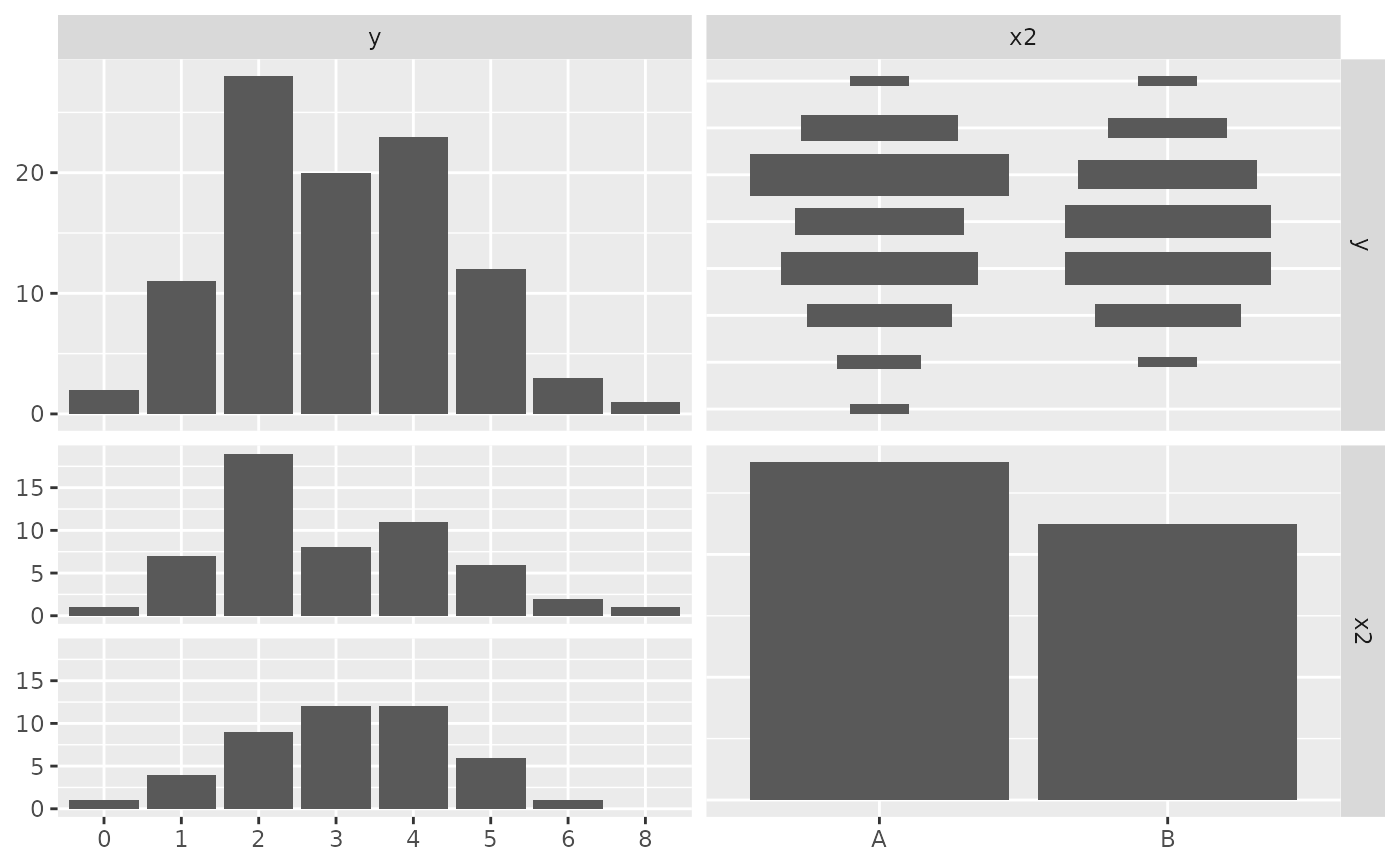
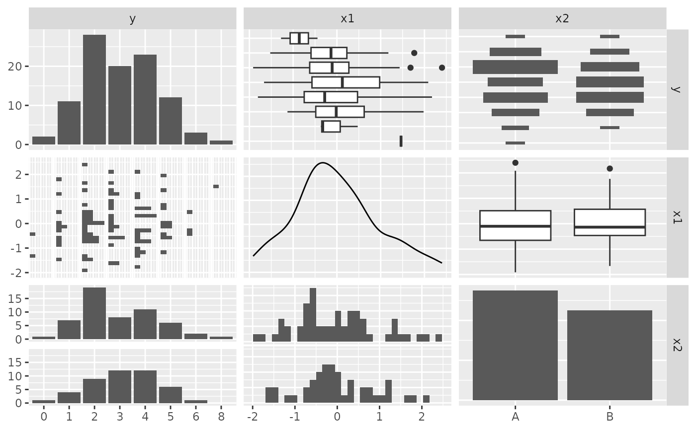
ggplotobject. The plot type depends on the number and type of predictors - see Details.- pairs_plot
A
ggpairsobject showing all pairwise relationships among the response and all predictors. The response is treated as continuous when it has more than 10 unique values, and as categorical (factor) otherwise.
Details
The graphical summary is chosen based on the predictors in formula:
- No predictors
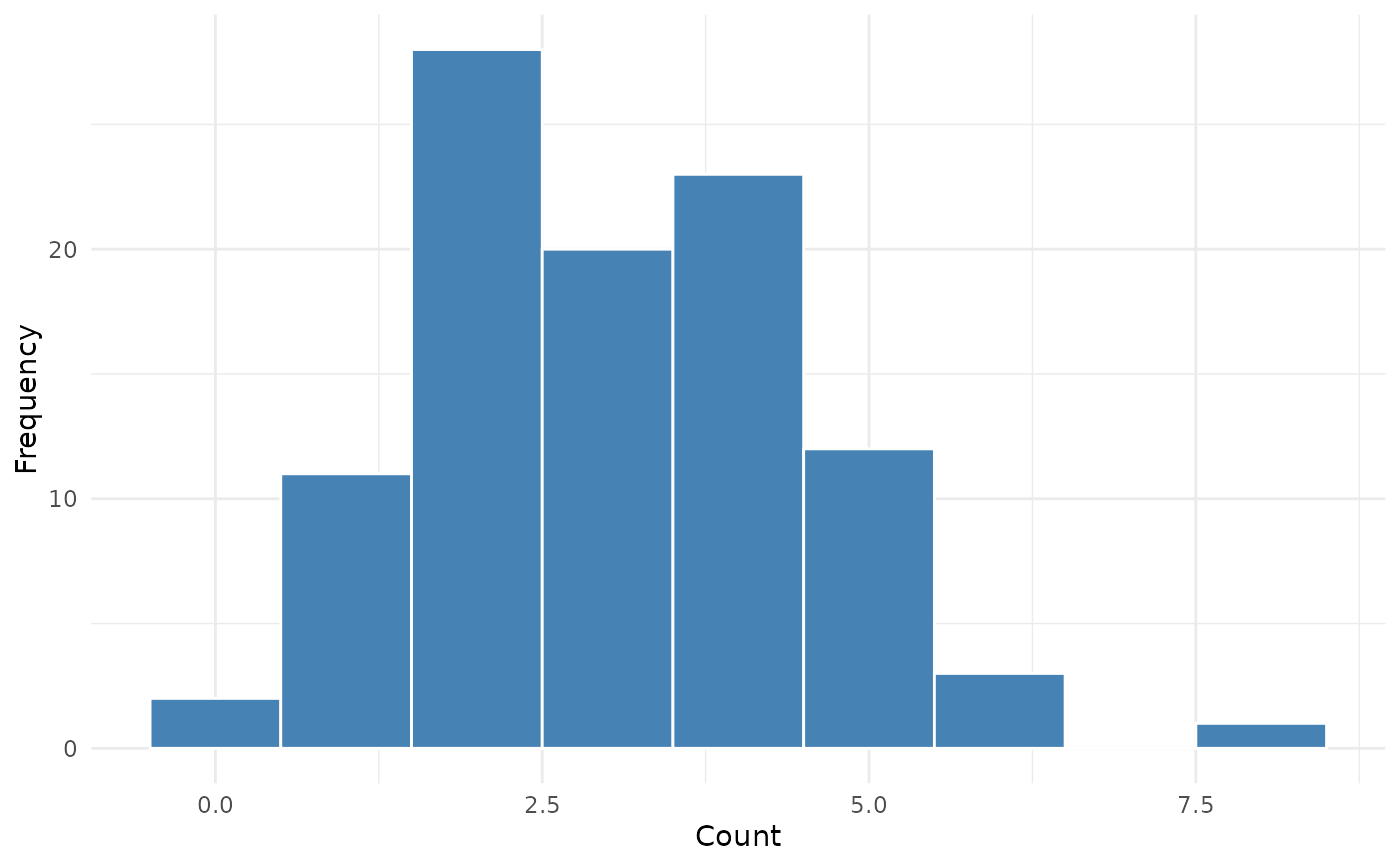
Histogram of the count response.
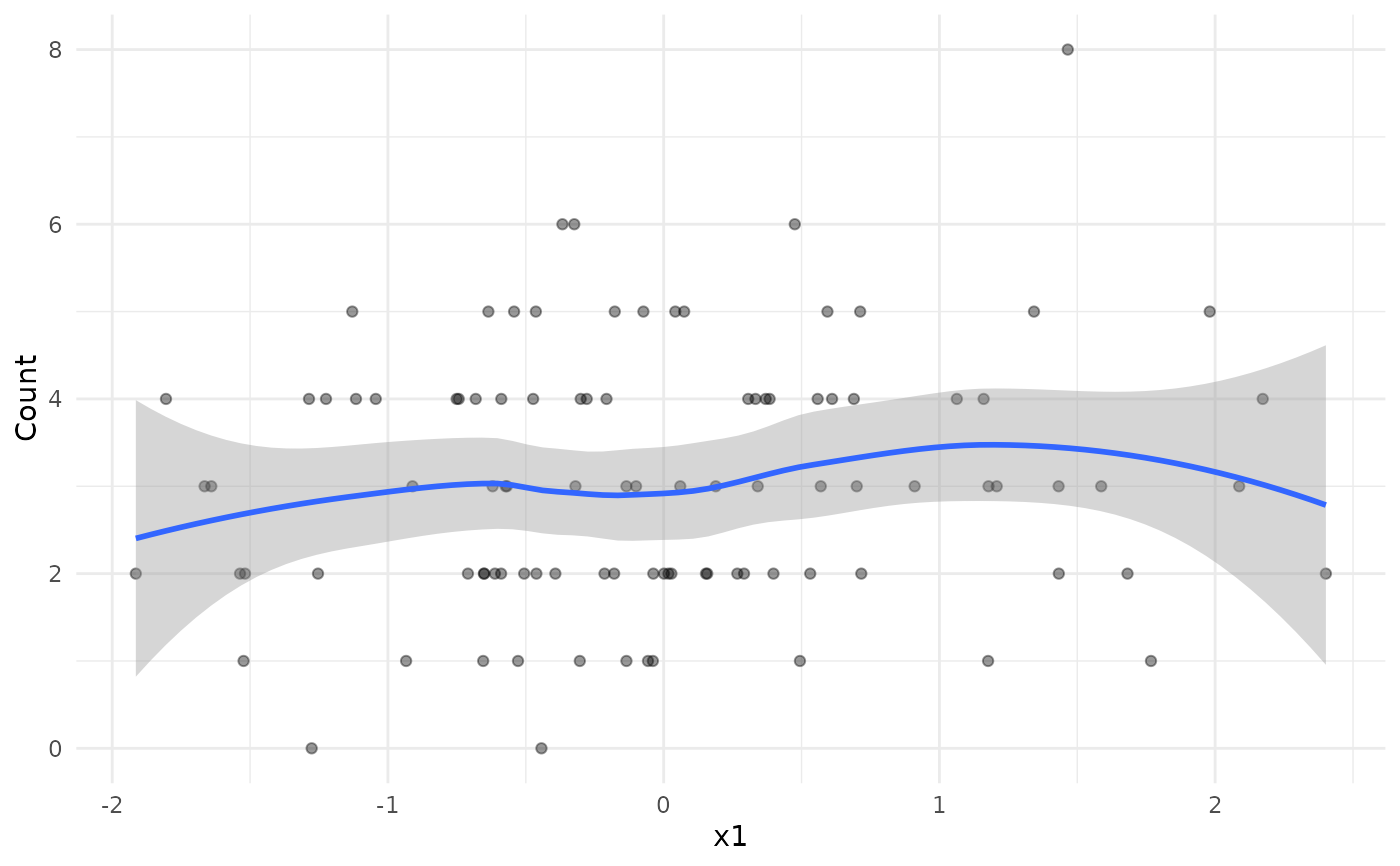
- One continuous predictor
Scatter plot with a loess smooth.
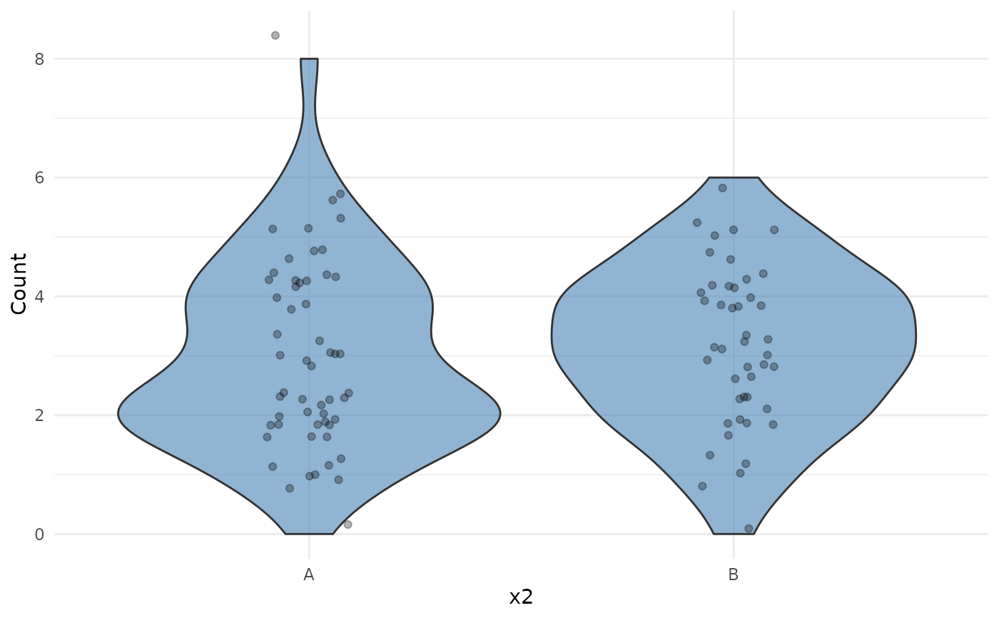
- One categorical predictor
Violin plot with jittered points.
- Two continuous predictors
2D bin plot (
geom_bin2d) with a viridis fill scale.- Two categorical predictors
Tile heatmap of mean counts.
- One continuous, one categorical predictor
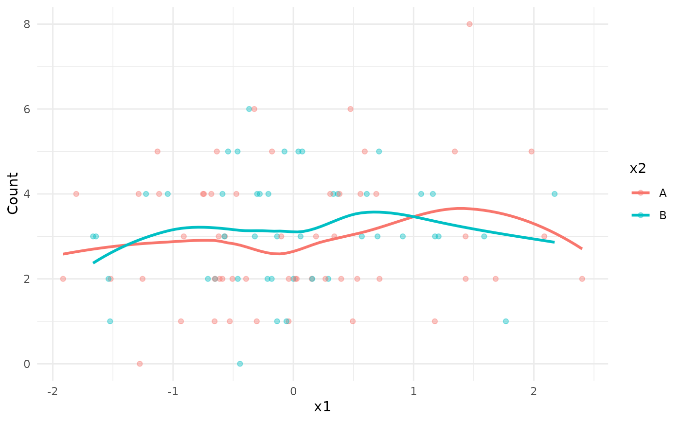
Scatter plot with loess smooths coloured by the categorical variable.
- Three or more predictors
A warning is issued and only the first two predictors are used for the main plot. The pairs plot includes all predictors.
The var_mean_ratio in the summary table is the variance-to-mean
ratio. A value close to 1 is consistent with a Poisson distribution;
values substantially greater than 1 suggest overdispersion.
Examples
set.seed(1)
df <- data.frame(
y = rpois(100, lambda = 3),
x1 = rnorm(100),
x2 = sample(c("A", "B"), 100, replace = TRUE)
)
# No predictors
summarizeCountData(y ~ 1, data = df)
#> $summary
#> mean var var_mean_ratio n_zero prop_zero n_total
#> 1 3.05 2.14899 0.7045869 2 0.02 100
#>
#> $counts
#> count freq
#> 1 0 2
#> 2 1 11
#> 3 2 28
#> 4 3 20
#> 5 4 23
#> 6 5 12
#> 7 6 3
#> 8 8 1
#>
#> $plot
 #>
#> $pairs_plot
#>
#> $pairs_plot
 #>
# One continuous predictor
summarizeCountData(y ~ x1, data = df)
#> $summary
#> mean var var_mean_ratio n_zero prop_zero n_total
#> 1 3.05 2.14899 0.7045869 2 0.02 100
#>
#> $counts
#> count freq
#> 1 0 2
#> 2 1 11
#> 3 2 28
#> 4 3 20
#> 5 4 23
#> 6 5 12
#> 7 6 3
#> 8 8 1
#>
#> $plot
#> `geom_smooth()` using formula = 'y ~ x'
#>
# One continuous predictor
summarizeCountData(y ~ x1, data = df)
#> $summary
#> mean var var_mean_ratio n_zero prop_zero n_total
#> 1 3.05 2.14899 0.7045869 2 0.02 100
#>
#> $counts
#> count freq
#> 1 0 2
#> 2 1 11
#> 3 2 28
#> 4 3 20
#> 5 4 23
#> 6 5 12
#> 7 6 3
#> 8 8 1
#>
#> $plot
#> `geom_smooth()` using formula = 'y ~ x'
 #>
#> $pairs_plot
#> `stat_bin()` using `bins = 30`. Pick better value `binwidth`.
#>
#> $pairs_plot
#> `stat_bin()` using `bins = 30`. Pick better value `binwidth`.
 #>
# One categorical predictor
summarizeCountData(y ~ x2, data = df)
#> $summary
#> mean var var_mean_ratio n_zero prop_zero n_total
#> 1 3.05 2.14899 0.7045869 2 0.02 100
#>
#> $counts
#> count freq
#> 1 0 2
#> 2 1 11
#> 3 2 28
#> 4 3 20
#> 5 4 23
#> 6 5 12
#> 7 6 3
#> 8 8 1
#>
#> $plot
#>
# One categorical predictor
summarizeCountData(y ~ x2, data = df)
#> $summary
#> mean var var_mean_ratio n_zero prop_zero n_total
#> 1 3.05 2.14899 0.7045869 2 0.02 100
#>
#> $counts
#> count freq
#> 1 0 2
#> 2 1 11
#> 3 2 28
#> 4 3 20
#> 5 4 23
#> 6 5 12
#> 7 6 3
#> 8 8 1
#>
#> $plot
 #>
#> $pairs_plot
#>
#> $pairs_plot
 #>
# Mixed predictors
summarizeCountData(y ~ x1 + x2, data = df)
#> $summary
#> mean var var_mean_ratio n_zero prop_zero n_total
#> 1 3.05 2.14899 0.7045869 2 0.02 100
#>
#> $counts
#> count freq
#> 1 0 2
#> 2 1 11
#> 3 2 28
#> 4 3 20
#> 5 4 23
#> 6 5 12
#> 7 6 3
#> 8 8 1
#>
#> $plot
#> `geom_smooth()` using formula = 'y ~ x'
#>
# Mixed predictors
summarizeCountData(y ~ x1 + x2, data = df)
#> $summary
#> mean var var_mean_ratio n_zero prop_zero n_total
#> 1 3.05 2.14899 0.7045869 2 0.02 100
#>
#> $counts
#> count freq
#> 1 0 2
#> 2 1 11
#> 3 2 28
#> 4 3 20
#> 5 4 23
#> 6 5 12
#> 7 6 3
#> 8 8 1
#>
#> $plot
#> `geom_smooth()` using formula = 'y ~ x'
 #>
#> $pairs_plot
#> `stat_bin()` using `bins = 30`. Pick better value `binwidth`.
#> `stat_bin()` using `bins = 30`. Pick better value `binwidth`.
#>
#> $pairs_plot
#> `stat_bin()` using `bins = 30`. Pick better value `binwidth`.
#> `stat_bin()` using `bins = 30`. Pick better value `binwidth`.
 #>
#>